GRAPHIC DESIGN
Classic artistry dating back to the beginning, graphic design is the primary reason most designers and their craft even exists. With the possible exception of music, graphic design is the grandpappy of them all. Good graphics, logos, branding, etcetera are not only important but most necessary for any company wishing to be successful. The design behind it offers a window in to the company's aesthetic, purpose and authority.
How It Works
Graphic design might appear to be a fairly simple process to the lay-person, but in reality it can be an exhausting and life-changing event. When that first genius caveperson drew a hunter spearing an ox (or whatever, it's kinda rough), little did they know the world had drastically changed in that instance. Now Ugg and Onk would need a symbol for their game dressing business to attract attention over their primitive competitors. To that end, the caveperson designer would actually have to think about the purpose and intention of the design, which could greatly benefit the client.
The process itself is different for any job because each one is inherently unique. The designer will sketch out many ideas and use that raw process as a means of narrowing the options as they work. When they finally have several different mock ups they will usually present these options to the client for another round of changes and fresh ideas. This can go on indefinitely but preferably only a few times before a final direction is established. Once the design is molded and perfected only then is it deemed suitable for public consumption. Yum!
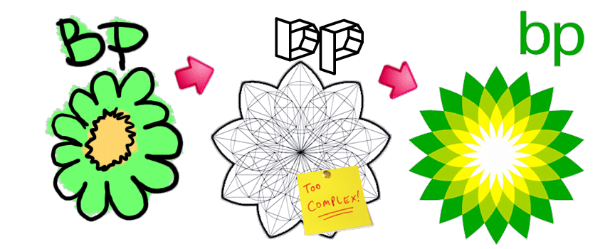
* The usage of the image of the BP® logo is in parody only and not intended to harm any designer's feelings
Randall Communications offers many services related to graphic design including logo design, branding, color identity, illustration, cleaning existing logo, modifying existing logo, and consultation. Please inquire with us directly about your specific requirements.
Samples of Works
(All sample images will open in a pop-up window)
Evergreen Aero Tech
Designed logo and branding for horticultural specialty company, using Adobe Illustrator® and Photoshop®. Client's product is symbolized in the final (left) design, along with the colors. Experimented with a variety of flora representations but finally settled on a simple triangle shape. The font is a very clean and simple face (Avenir) that is well balanced and has a nice professional look.
Victory Fire Protection
Reworked original logo and designed some new options such as 3D variations for the logo of a fire protection company. The old logo appeared as though it were created in MS Paint®, printed through a dot-matrix unit and then imported via a 4-bit document scanner. That is to say, it was pretty rough. We used Illustrator® to retrace and clean up the lines, and then opted to try out some new fonts. A couple serif and sans-serif versions along with the aforementioned 3D samples were presented to the client.
Autism Citizen
Designed logo for an autism charity. Although the project was cut short due to various conflicts of interest on the client's part, the logo was finalized early on. We went through a variety of iterations before settling on the 'A' puzzle piece (left image). Since autism awareness tends to focus on younger adults and children, the cartoonish look was deemed optimal. It is a neutral icon, too, after experimenting with a variety of illustrated children and determining that is misleading in its focus (seen in the right image). The font is a sans-serif which has a serious bent but retains some of its playfulness. We highly recommended the client trademark the logo regardless of the project status with the intention they could retain legal control over such a potentially lucrative branding.
Guide To Coaching Basketball logo
Designed logo for basketball coaching site, using Adobe Illustrator® and Photoshop®. The client bought and was rebranding an old Website that never really had any logo or discernible feel to it. Obvious in the approach, using a basketball icon was requested by the client. We created a variety, but decided on the illustration of the ball's panels. For the font (Bauhaus), it certainly has that retro vibe while retaining an easy legibility. A challenging aspect is the sheer length of the site name - so we broke up the name, stacked it accordingly and alternated the main colors to define the words.


Resin Finger Records illustrations
Illustrated several designs with Macromedia Freehand® to be used for various means including: album artwork, apparel designs, logo, and promotional pieces. Commissioned by Resin Finger Records and their band Stãmad. These pieces are some of Randall Communications earliest work for a client and remain a longtime favorite. The devil head piece was designed as a type of logo for the band to be used on clothing and any other suitable product. The severed hand illustration was heavily inspired by an old movie cover for House, as a promotional piece for the record label. Hand drawn then scanned and re-drawn with colors, it was a tedious process for both.
↑ TOP